 |
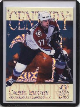
#10: 1999-00 Crown Royale Century 21
Nice sharp design once again from the people at Pacific. You got the player, superimposed in front of some cosmic cloud. Pacific then adds in some "shining" stars and the card text in a holographic foil that makes the card shine. Makes it shine just like the future of th players they depict in the set. Nice compostion, nice insert. |
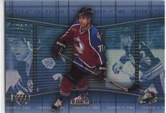 |
#9: 2000-01 Upper Deck Frozen in Time
These inserts featured a present-day star skating along in front of a gallery of photos from his earlier days. The effect is very nice, with the present-day photo being in color and the old photos being in black and white. The holographic shine adds more to the effect, adding emphasis to the present-day image while also drawing attention back to the older photos. The overall effect is quite nice. |
 |
#8: 1998-99 Crown Royale Rookie Class
From the very start the color composition makes this card stand out. The blue fading into green meshes nicely with the red to create an image soothing to the eye. The elliptical lines serve as a beautiful way to draw the eye straight to the focus of the card: the player. It all just comes togther so nicely, the right colors and a few mechanisms to be sure the eye focuses on the player. Very nicely done! |
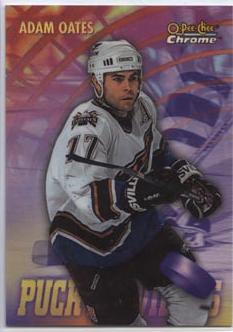 |
#7: 1998-99 OPC Chrome Season's Best
These cards are absolutely beautiful. First of all, Topps worked in 5 different subsets of Season's Best cards, on to commerate the goalies, rookies, goal leaders, assist leaders, and +/- leaders. Each subset features the player with the appropriate backdrop. And that's what really does it for these cards, the backdrop. All are designed well and they all just look cool. 5 great backdrops, 30 different players, it's a set that everyone should try and build. |
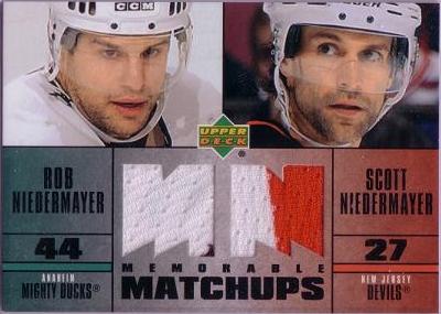 |
#6: 2003-04 Upper Deck Memorable Matchups Dual Jersey
Upper Deck really hit on something special here. The playoffs are what hockey is really all about, and this fairly common jersey insert delivers big time. The Nidermayer brothers battling each other in the Stanley Cup Finals, Kariya and the Ducks sweeping Fedorov and the Wings out in a huge first round upset, Brett Hull's controversial goal against Dominik Hasek, young upstart Jean-Sebastien Giguere dueling veteran superstar Martin Brodeur in the Finals ... all these captured on dual jersey cards. Great idea and best of all it wouldn't be too difficult a jersey set to build either. |
 |
#5: 1995-96 Donruss Elite World Juniors
Donruss Elite had one heck of a combination when they released these inserts. Not only do you put out cards of all the young stars of the time at the World Juniors (such as Drury, Parrish, Iginla, Thoedore), but you place them in front of a huge flag of their country. It makes for a beautiful card and the set pictures many of today's young stars before they cracked the NHL. That's a sweet combination! |
 |
#4: 2000-01 Be a Player Parkhurst 2000
BAP broke out big time for the 50th anniversary of Parkhurst. They included a whole bunch of Parkhurst inserts in their products. These inserts are elegant in their simplicity. No holographic foil or bright colors. Just the Pakrhurst Green, a line or two here and there, and the 50th anniversary stamp. Yet these are so attractive they sent many collectors scrambling to build the set as soon as they were released and they maintain their popularity today. Simplicity was never so sweet, a very fitting way to celebrate Parkhurst's 50th! |
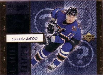 |
#3: 1998-99 Black Diamond Winning Formula
These cards just look sleek. First of all, the background color was made to match the player's team colors, making most of the cards just a bit different. The design has a couple of nice-looking vertical columns before giving the player a nice large space to himself. The serial numbering being based on some kind of "mystery number" also added a fun edge to these cards (even if it was easy to find on the back ...) |
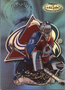 |
#2: 1999-00 Topps Gold Label Quest for the Cup
These Quest for the Cup inserts are pure artwork. The player picture comes together with the team logo which comes together with the Stanley Cup. The holographic shine in team colors caps the whole design off. A true piece of art. |
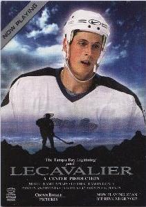 |
#1: 2000-01 Crown Royale Now Playing
Yep, a new #1! These Now Playing cards are simply brilliant, the idea of a fantasy movie poster is fresh and original. The card then promienently features a nice close-up portrait of the player over a nice, dramatic shilloute of a player on what looks like the traditional frozen pond. This is all wrapped up nicely by the text at the bottom, reading (in this case): The Tampa Bay Lightning present ... a Center production ... all the stats are there down below as well. It's just a great, original and new idea to give the same old stats and info fresh life. Brilliant! |


